Design
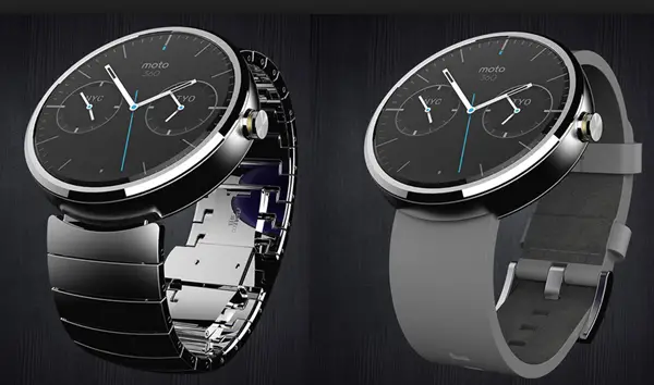
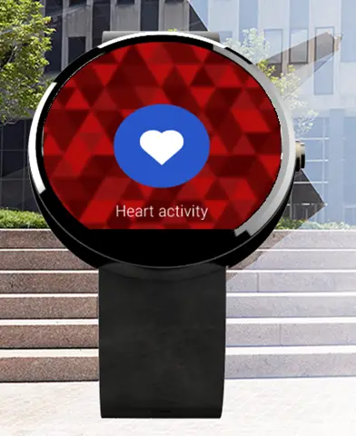
Moto 360 was the first Android Wear Smartwatch to acknowledge the fact that what you slap on your wrist must look good. The circular display smartwatch looks and feels quite premium and offers some customization options as well.
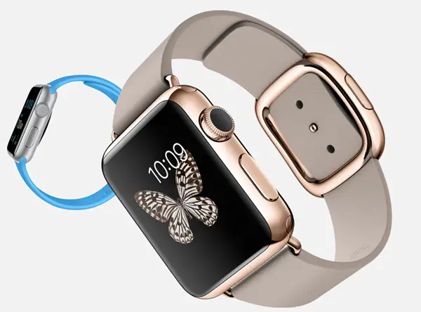
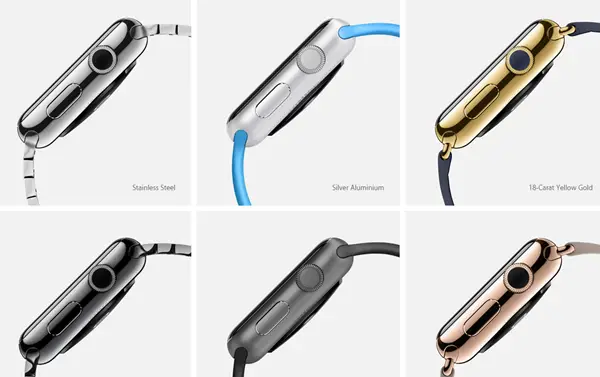
Apple Watch on the other hand is Square-ish like first generation Android Smartwatches and the design doesn’t outvote Moto 360 in our books. However, Apple Watch offers more customization options and uses more premium quality build with extremely durable Saphire glass on top – all of which adds to neat and nice Smartwatch.
Digital Crown and Taptic Engine
Digital Crown and Taptic Engine are two unique and very useful features on Apple Watch and symbolize the kind of work everyone was expecting from Apple in order to kick start wearable market. Since the display is small, it has to be operated in a different manner as compared to your phone. Apple has used a mechanical dial and empowered it to act as a home button, to scroll pages, to zoom in and do a lot more, without obstructing the screen.
Recommended: 7 Features of Apple Watch Which are Better Than Android Wear Watches
The Taptic Engine on the other hand will provide haptic feedback of different magnitude for different type of notifications and interactions. This is supposed to engage more of your senses and it does makes sense as something we would like to see on our smartwatch.
Google Now Integration and Glances
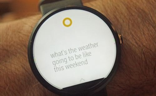
Moto 360, like all other Android wear smartwatches, relies heavily on Google Now. This is a good thing as there are several avid Google Now users, who can further enhance their Google Now experience by buying a Smartwatch.
Apple watch on the other hand uses ‘Glances’ a smart notification center which gathers notification from all apps. You can swipe up to see latest news and sport scores, travel itineraries.
Hardware
We don’t know much about Apple Watch hardware yet, but it does incorporate a Retina HD display (height: 1.5 Inch and 1.65 Inch) and a custom made S1 chipset for smartwatch. Moto 360 on the other hand is stuck on 4 year old TI OMAP 3 SoC which will be used to power its 1.56 Inch, 320 x 290, 205 ppi display. Yes, Moto G is using dated SoC which isn’t very power efficient, but that’s no reason to shun it just yet.
Battery
Moto 360 is powered by a 300 mAh battery (yup, not 320). While Motorola claims 1 day backup, several Moto G users are reporting a lot lesser than that. Apple didn’t talk much about the battery backup of Apple Watch at the launch event. Reports suggest that Apple isn’t very happy with the battery backup yet and plans to improve it before the device hits the shelves. Both watches support inductive charging.
Fitness
Moto 360 has a heart rate monitor which you will rarely use. You can count your steps and set targets. Apple Watch promises to take fitness aspact to a whole new level with two apps – Activity and Workout.
Besides heart rate sensor and Accelerometer, Apple Watch uses the GPS and Wi‑Fi in your iPhone to help measure the distance you travel during activities that can’t be measured in steps, such as cycling.
Availability
Availability does matter. While Moto 360 is available today, the Apple Watch is nowhere in sight for several months. Even a couple of months is a long time in tech world and perhaps till the time Apple Watch hits India, we will have a refreshed Moto 360 or several other Android wear watches which combine the best of both worlds.
Conclusion
At the end of the day, Moto 360 is available, has nice design, is compatible with all Android 4.3+ phones irrespective of OEM and is cheaper. AppleWatch on the other hand incorporates some inspiring innovation like the digital crown, but we don’t have any means to know how well the software has been executed, not till sometime later in 2015 and cost your $100 more. Perhaps the next generation of Android Wear watches will be a more fair competition. None of them sound compelling enough to make users switch platform.
